Banging Out – Fleet Street Remembered.

A documentary film, by  www.digital-works.co.uk, based on oral history interviews with former printers and journalists.

“There used to be a tradition in Fleet Street newspapers called “banging out”. It involved an employee, on the day he retired after a life-time’s stalwart service to his chosen rag, being walked by his colleagues through the presses in the print room. As he wandered towards his rendezvous with a carriage clock, the printers serenaded him by whacking the metal benches with their hammers, beating out a ceremonial slow-march to mark his departure.”
Jim White

Banging out also occured when apprentices passed out and when Fleet Street presses were shut down and moved to Wapping and Westferry in the 1980s.

For more information visit  www.bangingout.org.uk.

Letterpress Workers 2014 International Summit

I have just returned from the third  Letterpress Workers International Summit, organised and hosted by  Officina Novepunti. Located at Leoncavallo, Milan, between the 18th to 22nd June, the event was attended by international letterpress designers and printers, from as far afield as Mexico.

A large selection of printing presses and collection of wood type were assembled to be used by the attendees to create letterpress prints in editions of 50 copies on the topical subject of ‘Borders’. Following the event, the works were displayed at an exhibition alongside letterpress work from a selection of Italian designers.

Letterpress Workers appears to be going from strength to strength and I’m already looking forward to the 2015 edition!

lpw_2014-1_480lpw_2014-16_480lpw_2014-3_480lpw_2014-15_480lpw_2014-9_480lpw_2014-8_480lpw_2014-10_480lpw_2014-13_480lpw_2014-11_480lpw_2014-5_480lpw_2014-6_480lpw_2014-12_480lpw_2014-2_480lpw_2014-7_480lpw_2014-14_480lpw_2014-4_480

The letterpress designers and printers in attendance this year were Mark Pavey (UK), John Christopher (UK), Pete Burke (Denmark), Armina Ghazaryan (Belgium), Graham Bignell (UK), Jens Jorgen-Hansen (Denmark), Thomas Siemon (Germany), Portilla & Paniagua (Mexico), Tiny Risselada (Netherlands), Yago Bolivar (Spain), Anne Marie Koper (Netherlands), Sander Pinkse (Netherlands), Apmub (Portugal), Christian Granados (Spain), Pat Randle (UK), Nick Loaring (UK), Marc Berger (Germany), Justin Knopp (UK), Stéphane De Schrevel (Belgium), Edward Johansson (Finland), Lucio Passerini (Italy), &type (Italy), Roxy Columbus (Italy), Archivio Tipografico (Italy), Cabaret Typographie (Italy), Anonima Impressori (Italy).

Los Ultimos – Letterpress printing in Argentina.

Endless Letterpress is a documentary about present of woodtype presses in Argentina, filmed by Nicolás Rodríguez Fuchs. Sadly I discovered this film after the fundraising effort had ended but more information can be found at fb.com/losultimosdoc

“Buenos Aires deepest suburbs, July 2013. Three old print shops disputes the printing of cumbia and boxing posters. Second and third family generations keep these old presses going on printing in the way that workshops worked 100 years ago: the same machines, letterpress and workers, as if time had not passed. But they are getting old, machines are breaking and workshops agonize. They are aware that the road ahead is short. They are the last letterpressers in Argentina.

However, in the chaos of Buenos Aires downtown, some young designers started printing posters and cards with this ancient technique. In their small ateliers they combine the old craft with modern materials and designs, keeping it alive. Inspired and energetic they face the limitations and reflect about the value of time.

These two worlds combines old knowledge with new visions. A new dimension, where time limits get diffuse. A new voice appears, which includes the workshops slow music and gives eternity to feelings experienced for all those years.

Endless letterpress is a film about typography, but above all, about a group of people passionate for an ancient craft. Will these old presses and workshops survive in a new art? Or it’s a new fad?”

A-Z lino-cut prints by James Brown.

We are loving these lino cut A-Z alphabet prints, designed and printed by London based illustrator  James Brown. Each letter of the alphabet is available – strictly limited to 100 signed & numbered copies – from  James’s online shop.

James_Brown_W_480James_Brown_A_480James_Brown_N_480James_Brown_D_480

I am the leaden army that conquers the world. I am type.

Of my earliest ancestry neither history nor relics remain. The wedge-shaped symbols impressed in plastic clay by Babylonian builders in the dim past foreshadowed me: from them, on through the hieroglyphs of the ancient Egyptians, down to the beautiful manuscript letters of the mediaeval scribes, I was in the making.

With the golden vision of the ingenious Gutenberg, who first applied the principle of casting me in metal, the profound art of printing with movable types was born.

Cold, rigid and implacable I may be, yet the first impress of my face brought the Divine Word to countless thousands. I bring into the light of day the precious stores of knowledge and wisdom long hidden in the grave of ignorance. I coin for you the enchanting tale, the philosopher’s moralising and the poet’s fantasies; I enable you to exchange the irksome hours that come, at times, to everyone, for sweet and happy hours with books – golden urns filled with all the manna of the past.

In books, I present to you a portion of the eternal mind caught in its progress through the world, stamped in an instant and preserved for eternity. Through me, Socrates and Plato, Chaucer and Bards become your faithful friends who ever surround you and minister to you.

I am the leaden army that conquers the world. I am type.

F.W. Goudy

‘Soldiers of Lead’ forming part of the Lord Mayor’s Parade in 1928

‘Soldiers of Lead’ from the London Society of Compositors, forming part of the Lord Mayor’s Parade in 1928, armed with metal types in place of rifles

Hand typecasting at the Atelier Press & Letterfoundry

The Atelier Press came into being in 1970 as the private press of Stan Nelson. Stan has been interested in printing since the age of nine, and formerly operated as the Nelson Job Shop and later as Norse Custom Printing. After becoming aware of the world of Fine Printing, Stan chose to name his press using the French word for the workshop of an artist or craftsman.

At the Atelier Press & Letterfoundry, Stan casts printers’ type using methods first developed in the 15th century. In this series of five short films, filmed by  Out of Sorts Film, Stan demonstrates the preparation of matrices, assembling of a hand mould, casting type and ‘dressing’ the cast letters.

Punchcutting at the Atelier Press & Typefoundry

Tempering punches & striking matrices

Assembling a French style mould

Casting type in a hand mould

‘Dressing’ the hand cast type

The 7th Meeting of The Occasional Print Club – Berlin

At the end of September 2013  The Occasional Print Club held their 7th meeting deep down in the basement of  Kulturwerk des BBK in Kreuzberg, Berlin, a grand building in Mariannenplatz that was formerly a Prussian hospital. In attendance this time were myself,  Thomas MayoPatrick Randle and  Ross Shaw.

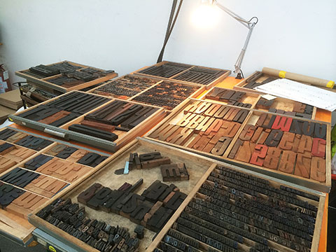
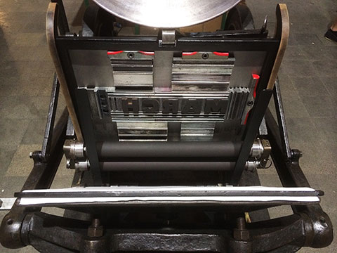
The Print Studio at  KBBK contains an impressive collection of continental letterpress type, some woodletter, an iron handpress and two large-format relief proofing presses – a gargantuan Korrex press manufactured by Max Simmel in Hamburg and a smaller FAG Control proof press.

After acquainting ourselves with the studio and the unfamiliar German typecase-layout, we set to work designing and typesetting, aware that we had less than 48 hours in which to create our next project. We were spoilt for choice with the array of metal types available and, after a fairly brief discussion of ideas, we decided to use as many of the typefaces available in our design, typeset to form the shape of a lowercase blackletter ‘b’ – ‘b’ for Berlin.

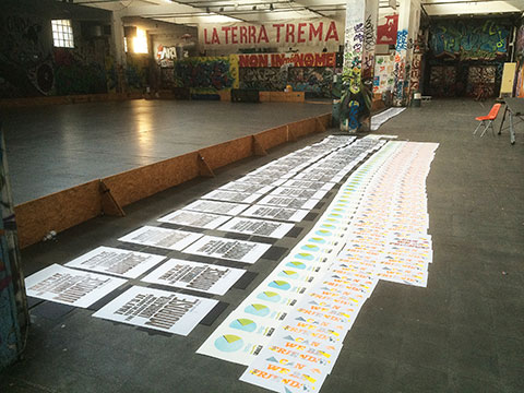
After one and half days of intensive typesetting briefly interrupted by a visit to the studio of master papermaker  Gangolf Ulbricht, along the corridor, we had transferred all of the type from settings sticks & galleys to the bed of the FAG proofing press. After locking the forme up, we took a first pull of the poster and after correcting a handful of typo’s, wrong-founts and spelling errors we turned our attention to choosing a colour scheme for the posters. We chose to print half of the edition in black and green with the remainder printed in red and green.

After printing late into the evening, we sought sanctuary in a nearby bar with hearty German fare and some celebratory Maßkrug’s of local beer.

Kulturwerk des BBK Berlin.

Pat and Ross exploring the cases of metal type.

German typecase layout

German typecase layout.

Tom Mayo inspecting the impression on an early proof.

Justin examining the first colour proof.

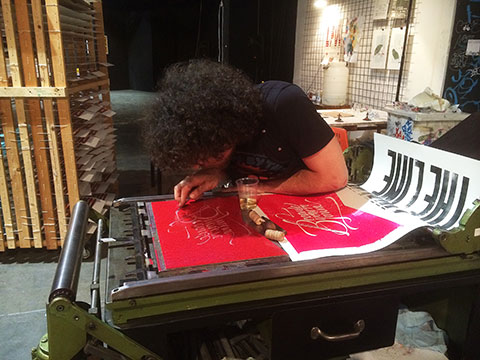
Ross printing on the FAG proofing press.

Limited to 50 copies and printed onto 100gsm Zerkall paper in two colours, copies this poster can be purchased  here.

A Cornucopia of Wooden Types.

Here at  Typoretum, we have embarked on an ambitious project to create a limited edition portfolio of experimental designs printed directly from wooden types.

The book will be letterpress printed on Victorian printing machines and will feature over 200 individual wood type faces from the private collection of Justin Knopp, founder of  Typoretum. The estimated publication date is Spring 2014 – if you would like to receive updates, please sign up to our mailing list at  http://typoretum.co.uk/woodentypes/

Specification:
– Limited edition of 250 numbered & signed copies
– 25cm x 35cm
– 48pp text & 4pp cover with printed cover wrap
– Singer-sewn thread binding

Jesús Morentin’s Bunkertype typography & letterpress studio.

Over recent months I have greatly enjoyed following  Bunkertype on Pinterest –  http://pinterest.com/bunkertype/ – in part due to our common admiration and respect for the letterpress work of  H.N. Werkman. Based in Barcelona, Jesús Morentin’s  Bunkertype letterpress studio produces beautiful and experimental letterpress work in small editions manually from metal and wood types.

Bunkertype on Pinterest:  http://pinterest.com/bunkertype/
Bunkertype on Flickr:  http://www.flickr.com/photos/bunkertype/
Bunkertype on Twitter:  https://twitter.com/bunkertype

Blackwater Polytechnic ‘Happy Days’ exhibition – 6th-14th July 2013.

We are currently exhibiting our letterpress work in the ‘Happy Days’ exhibition, curated by  Blackwater Polytechnic and hosted in Ben Coode-Adams & Freddie Robins’ award-winning Grand Designs barn here in North Essex, GB.

Wood type forme for our limited edition ‘Happy Days’ prints

Wood type forme for our limited edition ‘Happy Days’ prints.

‘Happy Days’ is “an exhibition of exceptional construction in wood, textiles, ink, paint, metal & concrete made by men and women with their hands”. See invitation below for details of participating artists and for opening dates & times.

For updates follow  Blackwater Polytechnic on Twitter or email [email protected] for address details or further information.