Extracted from a promotional booklet published by The Bauer Type Foundry, Inc. 235-247 East Forty-Fifth Street, New York. Publication date unknown.
THE PRINTER has many opportunities of learning how a type is cut and cast, and it is important that he should have this knowledge. How the stage of cutting is reached, the work that has gone before and all it involves – this can neither be learnt from technical books nor by the tour of a type foundry. For here we are dealing with work done in privacy, of very varying nature, and spread over a number of years – in some cases over decades. For this reason generalities on this subject would be of little value, but on the other hand it will help to foster understanding if the printer knows how the foundation of his own daily work is laid: and so we will try to follow a particular type face in all its stages from its first beginnings to the finished type in which form it is entrusted to the printer of to-day. The Weiss Roman, which was issued in 1931, will serve as the example for our purpose.

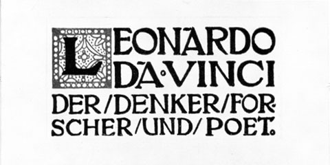
The history, or rather the preliminary steps towards the beginning of a history of this type dates back to the Autumn of the year 1905. A visit was paid by the proprietor of the Bauer Type Foundry to the young typographer, painter, and poet, Emil Rudolf Weiss in Baden-Baden, and it was agreed that besides new decorative material, both a new Roman and a new Fraktur should be designed by the artist. When the drawings for the decorative material were finished and delivered, the instructions for the design of a Roman letter were drawn up and agreed with all due formality; this was on the 18th June 1906. Very possibly some lettering as shown in our illustration, which had been used for book titling in 1904, was the starting-point for the preceding conversations; one will have had a mental picture something like this, of the type the cutting of which was soon to commence.
But everything happened differently. The Roman was not cut first, but the Fraktur – in honour of a special edition of Goethe. And thus was started a task which continued tenaciously for years. In 1911 the Weiss Fraktur was sufficiently complete to be able to be used for the volumes of the Tempel Verlag, which had been found in the meantime, and only in April 1914 was the full specimen, which had been prepared with the greatest care, completed. Its despatch had not begun when the Great War broke out and put a stop to the work with an iron hand.
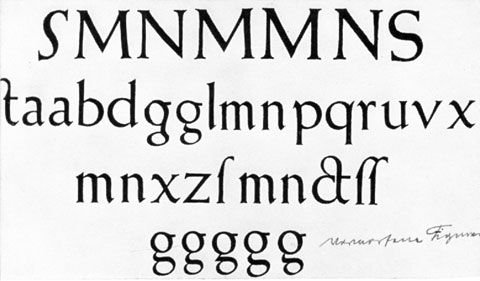
When after four years, peace was restored, the times, mankind, and type faces had changed. In spite of this, the old plan of cutting a Weiss Roman had not been forgotten at the Bauer Type Foundry, and the artist, too, had continued to work at this task. In quiet hours the pages of his sketch book were filled with letters, words, and lines. Our illustration shows such a page.

These letters bear scarcely any relationship to those of 1904. They are more sober and restrained, and have become incomparably more beautiful. In 1922 the designs of the new face had reached a sufficiently concrete form for artist and typefounder to consult together.

The work had now assumed direction, and the profile of the evolving design began to be recognisable, though in detail practically everything had still to be done. Countless drafts were made, each letter went through many transformations, was thought out afresh and the design re-cast. Now came the task of selection, whilst the artist with rigid self-criticism continued to alter or re-design. We show a page of sketches done at this stage.

A drawing, however carefully and painstakingly done, can at its best only give a rough idea as to how the type will look when reproduced in its final form. No sound judgement can be formed from single letters or complete alphabets, and if the artist draws words, undesired differences must occur in letter formation, whilst the metal types are fixed and unalterable, so that they have quite a different effect when assembled in words. For this reason photo-mechanical reproductions of the letter-designs are made, and are cut up and pasted together to form words. Line etchings are mostly employed; in our case photo-lithography was used.

To eliminate the distracting effect of the edges of the pasted-up letters, the words so formed are re-photographed, and reductions in various sizes are simultaneously made, giving a means of judging the effect of the smaller sizes and also indicating what difference in treatment may be necessary in the cutting of these sizes. These tests also simplify the choice of the letter-form best suited to a printing character, and in this way the alphabet reproduced here was arrived at, after many corrections and improvements, as the final version for cutting the first size.

Now began the task of Louis Hoell, one of the best punch cutters there has ever been. He cut the trial size – 28 point – in type metal, and then the first ‘smokes’ taken from the originals could be sent to the artist. Our illustration shows a few of the capital letters at this stage.

Most men would have been satisfied with Hoell’s conscientious work, but E. R. Weiss scarcely found one good letter amongst them. With the aid of chinese white and retouching pencil he indicated the alterations which seemed necessary to him, and so these characters had to be re-cut. Now at last matrices could be produced and justified. A trial casting was made, and the long-awaited moment had arrived. The first lines were set and proofed and sent to the artist. The result can be guessed from our illustration; out of fifteen characters on this page, seven did not meet with approval, and had to be re-cut, fresh matrices struck and justified, and a new casting made. It is not necessary to relate here how often this was repeated in the course of the continued work; the reader can see for himself that several of the unsatisfactory letters, e.g. “i” and “l”, look quite different in the finished version.

One day, however, the cutting of the first standard size was completed. The artist had passed each single character as conforming to his standards, and whilst one could now commence in the typefoundry with the important and difficult task of determining the set of the letters on the body by means of countless proofs of words with the characters in every conceivable combination, artist and punch-cutter began with the work of cutting other sizes of the letter. Theoretically everything should now have been determined except for the alterations of the drawings necessitated by enlargement or reduction. These alterations, as is well known, must not be made purely mechanically; a letter which looks well in its standard size would, for example, appear too condensed and too spidery in the small sizes. The extent of the corrections necessary in the course of the work can however be judged by the illustration of a proof-page of a medium size, taken at random from the files.

Here the artist comments for example “The g is of a really grotesque ugliness! That is why I have re-drawn it twenty times!”. To cut a long story short, each size followed much the same course, for all those concerned took their work seriously – Artist and Punch-cutter, as also the artistic direction of the typefoundry which had to act as intermediary, and if plain language was used in the correspondence for the sake of clarity, nobody lost that patience which is one of the first essentials in any matters connected with type production. The reader will not wonder, now, that in the year 1924, when setting has begun on the great jubilee book for the 50th birthday of E. R. Weiss, only a few sizes of the new Roman were ready, and it was only in 1931 that the type was given to the world, together with its accompanying bold and italic faces.


