Letterpress ‘IEE’ poster for Public Service Broadcasting.

Public Service Broadcasting commissioned  Typoretum to design and letterpress print a limited edition (100 copies) poster, to accompany the launch of their debut album ‘Inform, Educate, Entertain’ (publicservicebroadcasting.net/inform-educate-entertain-out-now/) in May 2013.

Limited edition Public Service Broadcasting letterpress ‘IEE’ poster.

Limited edition Public Service Broadcasting letterpress ‘IEE’ poster.

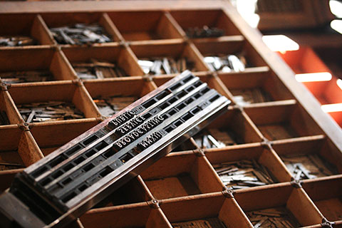
The posters were printed from antique Elongated Sans Serif wood type and Granby Light metal type onto high-quality 170gsm cartridge paper, signed and editioned by J. Willgoose Esq. himself.

Reviews for IEE:
publicservicebroadcasting.net/reviews-for-i-e-e/

Typoretum: A Letterpress Workshop

Here is a great short film about  Typoretum. An opportunity to see our presses in action and the craft of letterpress printing.

Irish graphic designer and letterpress printer  Jamie Murphy recently spent several months working here at  Typoretum, developing his knowledge of letterpress typesetting and printing. As a thank you for his time here, Jamie kindly produced this short film, working with the incredibly talented Áine O’Meara of  Yellow Brick Media.

Art Direction: Jamie Murphy (thesalvagepress.com/)
Production: Yellow Brick Media (yellowbrickmedia.ie/)
Music: Public Service broadcasting (publicservicebroadcasting.net/)
Location: Typoretum (typoretum.co.uk/)

‘The Wit & Wisdom of Leopold Bloom’ – a letterpress book project.

Fresh from his three-month placement at  Typoretum, Jamie Murphy, a Dublin-based designer and letterpress printer, is seeking funding for an exciting letterpress book project – a limited edition of The Works of Master Poldy.

The book will be printed by hand from wooden and metal types at  The Distillers Press in Dublin, where Jamie is about to undertake a design residency for the coming year. Experimental typographic treatments will act as illustrations and the book will be printed on Zerkall mould made paper and hand bound by Tom Duffy at his workshop in Dublin’s Five Lamps. The book will measure 38 x 22 cm and will be available in two variants. Jamie hopes to launch it on Bloomsday, June 16th this year.

We doff our printer’s hats to Jamie and wish him the very best of luck with this admirable project! More information about Jamie’s project and funding options can be found on his  Indiegogo page.

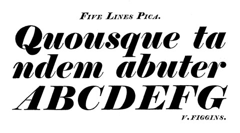
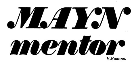
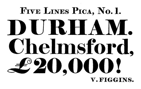
Type Specimens from the Vincent Figgins Type Foundry – 1815.

A hand mould, for the casting of metal printing types.

The British punch-cutter and typefounder Vincent Figgins (1766-1844) ran a notable London typefoundry and is credited with designing the first Egyptian (slab serif) typeface, which he simply named ‘Antique’ and released in 1815. Figgins was originally apprenticed to the typefounder Joseph Jackson, a student of William Caslon I, and established his own typefoundry in Swan Yard, Holborn Bridge, in 1792.

Figgins’ designs reflected a trend in the early nineteenth century toward the use of bolder types, rather than the lighter faces popular at the end of the previous century. The new style of types met with a mixed reception, with descriptions of them ranging from “the most brilliant typographical innovation of the nineteenth century” to them being described as a “typographical monstrosity”. Figgins is also believed to have introduced the term ‘sans-serif’, with the introduction of a typeface of that name in the 1820s – possibly 1828.

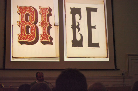
All images shown below have been extracted from the book ‘Vincent Figgins Type Specimens – 1801 and 1815’, published in 1967 by the Printing Historical Society. This book reproduces, in its entirety, a publication of specimens of printing types by Vincent Figgins dated 1815 showing a range of types and typographic ornaments ranging in size from sixteen lines Pica down to Diamond at a diminutive 4½pt.

View of the Figgins Type Foundry c.1833.

A view of an unknown 19th Century letter foundry, taken from The Penny Magazine.

‘For the Love of Letterpress’ film.

A short documentary by White House Films, filmed at the Distiller’s Press in Dublin, Ireland, featuring  Jamie Murphy who is currently here at Typoretum on a 3-month Leonardo da Vinci programme placement.

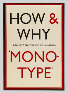
Pencil to Pixel – Exhibition of artifacts & artwork from the Monotype archive.

The history of  Monotype dates back to the late 19th Century, when it introduced groundbreaking new technology that revolutionised the production of metal type for letterpress printing.  Tolbert Lanston, the inventor of this technology and founder of The Lanston Monotype Machine Company, patented this mechanical typesetting system in 1887 and introduced the first hot metal typesetter a few years later.

In 1897, Monotype established a factory in the UK, producing type mostly from designs that were already in common use at that time. Following the successful introduction of the Monotype system the company went on to develop a raft of new typefaces, many of which became hugely popular, such as Times New Roman and Gill Sans.

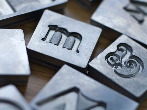
Monotype Supercaster Matrices

Monotype Supercaster Matrices

The exhibition will be showcasing selected pieces from the Monotype archives including artwork, original drawings, typecasting artifacts and publications. Admission is free, and you can book a ‘guided tour’ (also free) via  Eventbrite.

Monotype – Pencil to Pixel is at Metropolitan Wharf, 70 Wapping Wall, London E1, from 16-23 November and opening times are 10.00am-7.30pm.

Original drawings for the Gill Sans typeface

Original drawings for the Gill Sans typeface


Detail of a Monotype Composition Caster Matrix Case

Detail of a Monotype Composition Caster Matrix Case

The Artists of Spitalfields Life exhibition.

We’re delighted to be exhibiting our ‘In the Midst of Life I Woke’ letterpress poster alongside fellow “Artists of Spitalfields Life” in a forthcoming exhibition at the  Ben Pentreath Shop in Bloomsbury, London.

The exhibition runs from 7th-24th November and further details & opening times can be found here.

20121104-224453.jpg

The London Centre for Book Arts

The London Centre for Book Arts is an open-access book arts studio, teaching facility and exhibition space in Fish Island, Hackney Wick, in East London.

The first and only centre of its kind in the United Kingdom, LCBA provides access to specialist equipment and resources, including rare and historically important pieces, along with technical and educational support. They welcome the general public and specialist practitioners alike, and extend a special welcome to members of the local community. A space for hands-on experience, knowledge sharing and skills exchange, LCBA provides a forum for all those interested in the past, present and future of book arts and artists’ books.
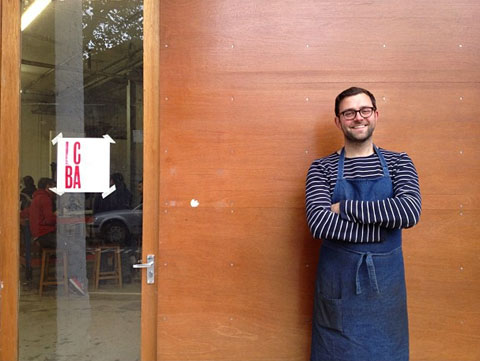
Simon Goode pictured outside The London Centre for Book Arts

Simon Goode pictured outside The London Centre for Book Arts

The founder and driving force behind LCBA is Simon Goode, a BA (Hons) Book Arts and Crafts graduate from  London College of Communication (2006). Simon studied bookbinding and book arts, printmaking and artists’ book production at LCC and after graduating, found it difficult to continue the practice he’d begun while at College due to lack of access to the specialist equipment required to print and make books by hand. After a number of years trawling online auction sites, newspaper classifieds and through friends-of-friends, he’d collected enough of the necessary equipment – bookbinding presses, guillotines, printing presses and type, etc, to set up a book arts studio.

A big part of Simon’s practice at the time was teaching workshops, for which he travelled up and down the country to colleges, universities, art galleries, etc. Like many artists, this enabled Simon to continue working on his own work, and the idea was born to combine his own studio with teaching – to share the tools and equipment so others could benefit.

Simon Goode printing on the Vandercook press at Minnesota Center for Book Arts

Simon Goode printing on the Vandercook press at Minnesota Center for Book Arts

In the spring/summer of 2011, Simon travelled on a 3 month research trip to the United States to visit well-established centres dedicated to book arts (simongoes.tumblr.com), which have been popular there since the late 1970s, but, unusually, had not yet taken off in the UK. He spent 4 weeks as a visiting artist at the larget book arts centre, the Minnesota Center for Book Arts, which allowed him the time to study how a centre such as this operates.

And thus the idea for the London Centre for Book Arts was born.

You can support the London Centre for Book Arts by becoming a  Friend of LCBA or by signing up to one of their first workshops through their  Eventbrite page. LCBA are currently offering classes in Introduction to Papermaking, Introduction to Letterpress, and Bookbinding for Artists I & II.

‘Letterpress: something to say’ conference at the St Bride Library.

On Friday 9th November 2012, the  St Bride Library will hold its’ third letterpress conference. The previous two conferences have been sell-outs and speakers include Anthony Burrill, Catherine Dixon, Ian Gabb (RCA), Thomas Gravemaker, Dylan Kendle (Tomato), Peter Nencini, and L’automatica (Barcelona) with further contributions anticipated from Prensa Libertad (Buenos Aires) and Vista Sans Wood Type Project.

“A one-day conference exploring letterpress as a means for delivering real content, be that a set of sharply thought-through design intentions; a re-imagining of the possibilities of the inky process itself; an analogue springboard to new digital visuals and environments; or a reconnection with the power of a simple press to communicate ideas.

To step beyond the production of work to be merely admired and consumed, and to reclaim letterpress as a viable means of distributing a message; to tell stories; to galvanize our communities; to allow practice to resonate beyond the frames of our living room walls.”

For further information, or to book tickets to the Conference, click  here or visit the  St Bride Library website.

Jules Vernacular – collector of vernacular typography & lettering.

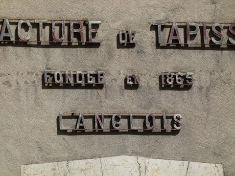
‘Manufacture de Tapisseries’ signage found in Blois, France. Photograph © Justin Knopp 2012

After ‘collecting’ some examples of French signage (an example of which can be seen above) whilst on a recent holiday, I discovered the online collection of vernacular typography, lettering & signage assembled on the  Jules Vernacular website.

‘PTT’ signage. Photograph © Jules Vernacular 2006-2012

‘PTT’ signage. Photograph © Jules Vernacular 2006-2012

This collection has been carefully collected and assembled by  Jack Usine and is a complementary project of  Smeltery, Factory’s type foundry, that creates typefaces inspired by this heritage.

‘Coucous Merguez’ lettering. Photograph © Jules Vernacular 2006-2012

‘Coucous Merguez’ lettering. Photograph © Jules Vernacular 2006-2012

‘Poissonnerie Modele’ shop front. Photograph © Jules Vernacular 2006-2012

‘Poissonnerie Modele’ shop front. Photograph © Jules Vernacular 2006-2012

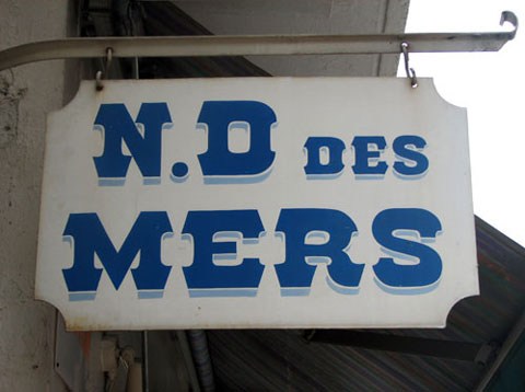
‘N.D des Mers’ signage. Photograph © Jules Vernacular 2006-2012

‘N.D des Mers’ signage. Photograph © Jules Vernacular 2006-2012