Typoretum featured on Spitalfield’s Life

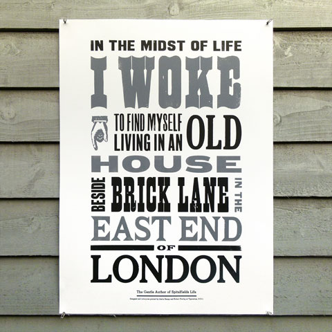
We were recently commissioned by  St Jude’s to illustrate an interview with the The Gentle Author of  Spitalfields Life in the first issue of  Random Spectacular, published this week in aid of  Maggie’s Centres.

As a result of the commission, The Gentle Author visited our letterpress workshop and interviewed me for the  Spitalfields Life journal – this interview can be read  here.

We have printed a 150 copy edition of the print and copies can be purchased via our website  here. A 20% donation is made to  Maggie’s Centres for each print sold.

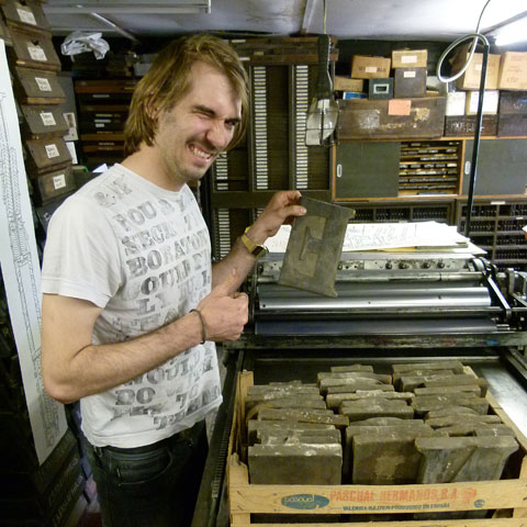
Justin Knopp printing ‘In the Midst of Life I Woke’ posters on his 1851 Albion press

Limited edition ‘In the Midst of Life I Woke’ letterpress poster by Typoretum.

‘Ampersands’ wood type print by New North Press

Our friends over at  New North Press, Richard Ardagh and Graham Bignell, have created a new letterpress print from a range of wood type ampersands.

The damped paper was blind embossed revealing the shapes of the type blocks themselves, then it was flipped and printed with a clear varnish showing the mirror image of their printed form.

Set and printed by hand in an edition of 200. Available to buy online from  New North Press.

The Ludlow Project – Saving Hot Metal Typecasting History

We’ve received an appeal from our friends at the  International Printing Museum to help spread the word about  The Ludlow Project, an effort to augment their collection of Ludlow matrices to be as complete as possible.

They have brought the campaign to Kickstarter, where there have been a significant number of successful letterpress-themed projects. You can view their video appeal, that supports their very worthy campaign, below.

Typecasting at The Whittington Press

I recently had the great pleasure to return to Whittington again to exhibit at the  Whittington Press Open Day 2011 and was delighted to watch – through the fug of fumes from the  Monotype casters – brand new type being cast by Neil Winter (ex-Libanus Press).

Since John Randle bought his first  Monotype caster and keyboard at auction for  The Whittington Press in 1981, their range of typefaces and  Monotype equipment has increased considerably and they have recently started casting founts of type for sale.

Having acquired the entire library of  Monotype diecases of the Oxford University Press in 1986 when the OUP closed its printing division,  The Whittington Press had assembled one of the most comprehensive collections in existence. The casting operation was originally run by retired  Monotype operator George Wiggall and is now run by Neil Winter, who is an experienced operator & engineer and looks after their three Composition Casters and two Supercasters.

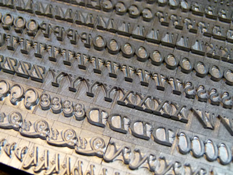
Packets of semi-founders’ Caslon type cast at The Whittington Press

The Whittington Press has started casting some of their rarer founts for sale, starting with Caslon in 18-, 22-, and 24-point, roman, italic and small caps, with castings of Centaur, Bible Centaur and innumerable ornaments & fleurons are underway.

A fount of semi-founders’ Caslon type cast at The Whittington Press

Monotype diecases & layouts at The Whittington Press (image courtesy of Ian Knight/Printmonkey Press)

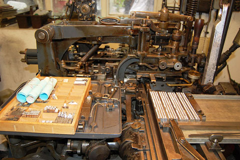
A Monotype Composition Caster at The Whittington Press (image courtesy of Ian Knight/Printmonkey Press)

Detail of a Monotype Composition Caster at The Whittington Press

1Q84 by Haruki Murakami – Limited Edition

After being sworn to secrecy over the past few months, we can finally reveal a rather special book project that we have been working on – a limited edition of Haruki Murakami’s 1Q84. We letterpress printed the covers onto Somerset Velvet Newsprint 280gsm card stock and the book edges were printed at our studio using an innovative technique that will be staying a closely guarded secret!

This signed and numbered edition of 1Q84 is limited to exactly 111 copies. The front and back covers are printed on Somerset, a 100 percent cotton archival paper, using a Swiss-made 1963 Gietz Art Platen hand-fed letterpress. This limited edition is a collaboration between Simon Rhodes, Kristen Harrison at  The Curved House and designer  Stefanie Posavec. Text design by Jim Smith. Covers printed by Justin Knopp at   Typoretum. Text pages printed and bound by Graphicom, Verona. Published by Harvill Secker in 2011.

1Q84 Limited Edition – Books 1, 2 & 3

1Q84 Limited Edition – Signed back of Book 3

1Q84 Limited Edition – Book 3

1Q84 Limited Edition – Book 2 (detail)

More photographs of this project can be viewed on our  Flickr Photostream.

Rural Landscape – Art Car Boot Fair

We are delighted to be exhibiting at the  Rural Landscape – Art Car Boot Fair on Saturday 1 October 2011, 12-4pm at Roudham Farm, Roudham, Norfolk NR16 2RJ. We will be showing our letterpress work and our letterpress posters and greeting cards will be for sale. We hope to see you there!

The Occasional Print Club – 5th meeting

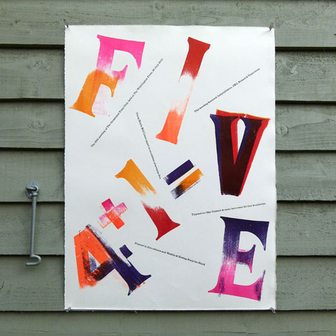
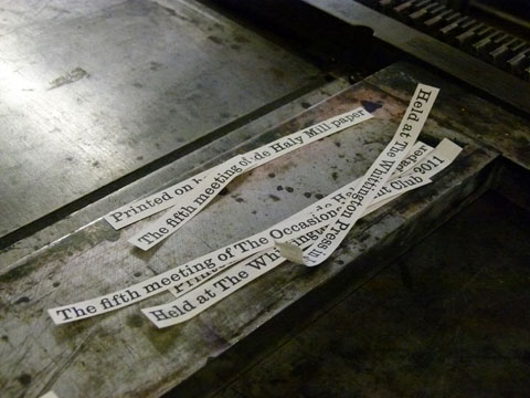
The fifth meeting of the  Occasional Print Club took place in late July at  The Whittington Press and this time the four existing members (Jonathan KieltyJustin KnoppPat Randle and  Ross Shaw) were joined by Swiss graphic designer & letterpress printmaker  Dafi Kühne.

During the weekend meeting a 75 copy edition of a six colour letterpress poster was designed, typeset and printed. The poster measures 580 x 740mm and is printed onto handmade Hayle Mill Linen paper, very generously provided by John Randle, proprietor of the Whittington Press.

More photographs of the work-in-progress can be viewed on the  Occasional Print Club’s Flickr site and a limited number of copies of the poster can be purchased  here.

Letterpress ‘4+1=V’ poster by The Occasional Print Club

Dafi Kühne choosing woodletter letters for the poster

Ross Shaw taking printed posters from the Western proofing press

World’s Largest Printing Type?

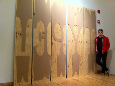
Brooklyn-based typographer  Nick Sherman has just created what he believes to be the world’s largest printing type. Standing at 576 lines pica (8 feet) tall, I’m inclined to agree! Nick designed, produced, and printed these wooden letters for the Wood Type Evolved exhibition at Columbia College Chicago.

Nick Sherman standing with his 576 lines pica, or 8 feet wood type (image © Nick Sherman 2011)

Nick Sherman standing with his 576 lines pica, or 8 feet wood type letters (image © Nick Sherman 2011)

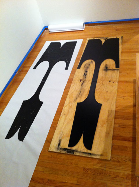
World’s largest movable letter ‘T’ alongside the print Nick Sherman made from it (image © Nick Sherman 2011)

576 lines pica (8 feet) tall letter ‘T’ alongside the print Nick Sherman made from it (image © Nick Sherman 2011)

World’s largest movable type and prints drying (image © Nick Sherman 2011)

Nick Sherman’s 576 lines pica (8 feet) tall printing type and equally large prints drying (image © Nick Sherman 2011)

More images showing the process employed to create this type can be viewed on  Nick Sherman’s Flickr Photostream.

Whittington Press Open Day 2011

We will returning to Whittington again this year, on Saturday 3rd September, for the annual Whittington Press open day, where we will be exhibiting our letterpress work, posters and greeting cards.

Pochoir illustration by Miriam MacGregor

Pochoir illustration by Miriam MacGregor

We are looking forward to meeting up with old friends, fellow letterpress printers, booksellers, engravers, marblers and others who will also be exhibiting their wares. It is also the Whittington village summer show, and the historic Whittington Court (whose gardener’s cottage has been home to the Press since its inception) is open to the public.

Further details can be found on the  Whittington Press website and photographs from last year’s open day can be viewed  here.

Whittington Press Open Day 2010

Whittington Press Open Day 2010

Critical Tensions – Tenth annual St Bride Library conference

On Thursday 10th & Friday 11th November 2011, the  St Bride Library will hold its’ tenth annual conference on the theme of Tension in design. Speakers include Phil Baines, Jonathan Barnbrook, Zoë Bather, Alan Kitching, Gerry Leonidas, Lucienne Roberts, Vaughan Oliver, Paul Rennie, Jack Schulze, Steve Watson, Rebecca Wright and Derek Yates.

“Tension is frequently described as a positive in design, with designers balancing opposing constraints and visual ideas in often ‘perfect tension’. Design work balances a whole series of tensions: analogue–digital; male–female; Twitter–Facebook; art–design; East–West; old–young; interns–employees; global–local; micro–macro; educated–‘feral’; in-house–independent; degree course–short course/apprenticeship; designer–client.

In these uncertain times of economic and educational cutbacks, what of the old adage that from adversity comes creativity? In the aftermath of WWII, the exhibition ‘Britain can make it’ celebrated the potential of design as a tool for national recovery. The political struggles of the 1960s fuelled the portfolios of a generation of our most celebrated graphic designers. So where are seeds of creativity emerging from current struggles? What are the key points of tension today and what possibilities for designerly making and thinking are opening up as a result? Is tension vital to the design process itself?

Join us to such ask questions and more at Critical Tensions, the tenth annual St Bride Library conference, 10–11 November 2011. Embracing history, education and design practice, this two-day event provides a space for meeting and voicing concerns, for collectively exploring ideas, sharing strategies, consolidating knowledge, and for challenging and reaffirming values.”

For further information, or to book tickets to the Conference, click  here or visit the  St Bride Library website.